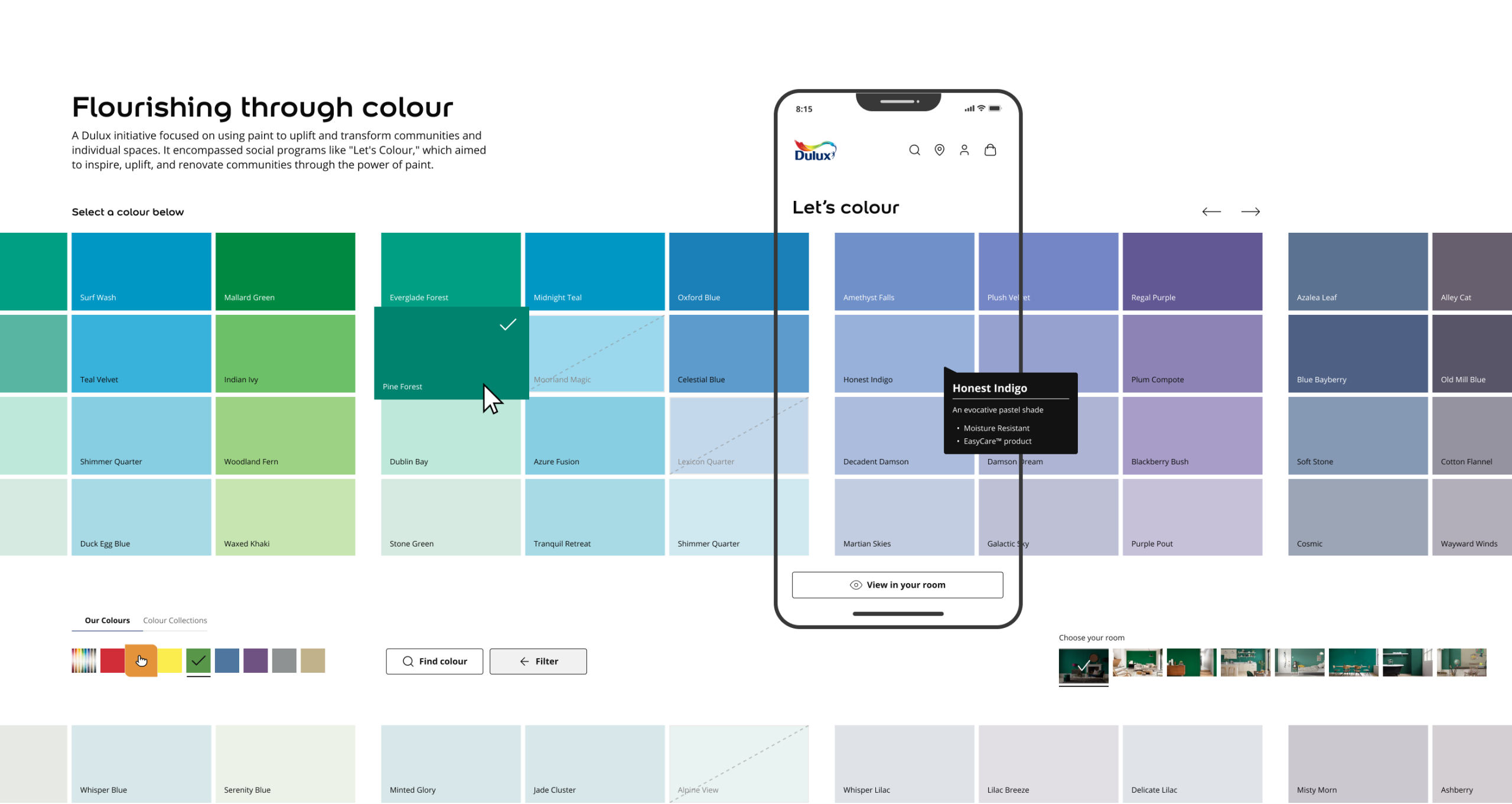
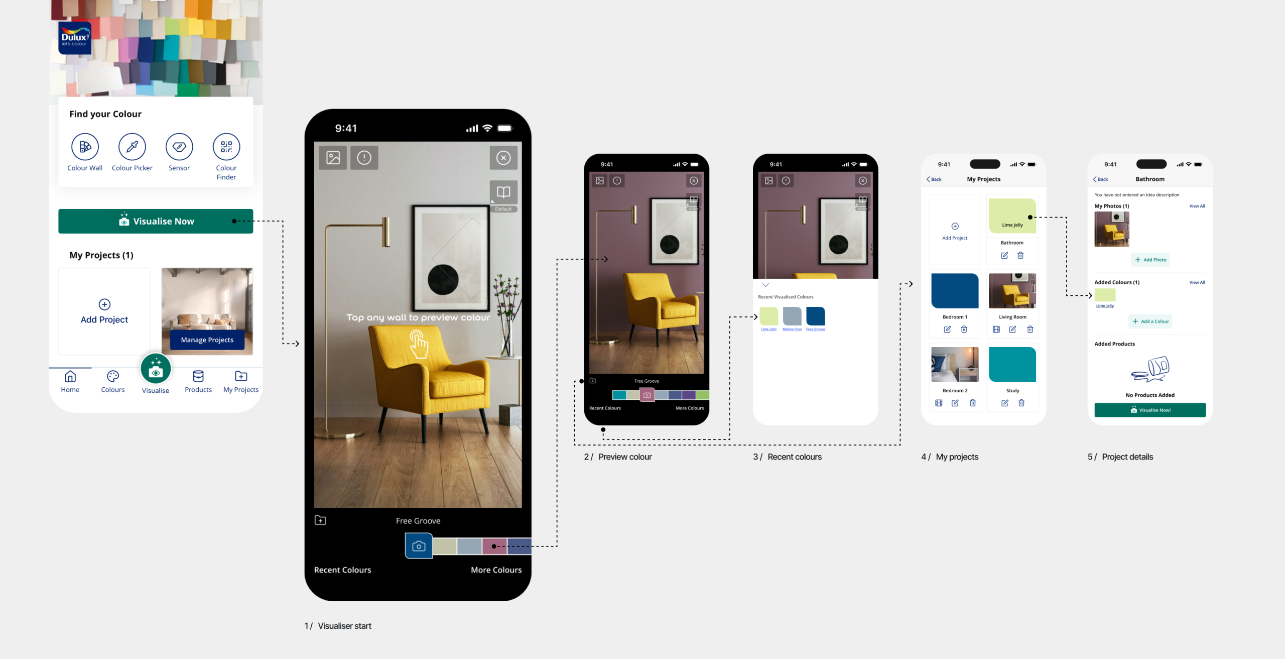
The Dulux Visualiser (often referred to as the Let’s Colour app) is an augmented reality app that allows users to instantly see what a room will look like with a new wall colour before painting. It uses phone cameras to live-preview over 1,200 Dulux colours, match colours from surroundings, and order testers directly.
I was involved as an IC Product Designer across all parts of this project.
Scope of work
Strategy, Research, Design System, Product Design, UX, UI
Year
2024
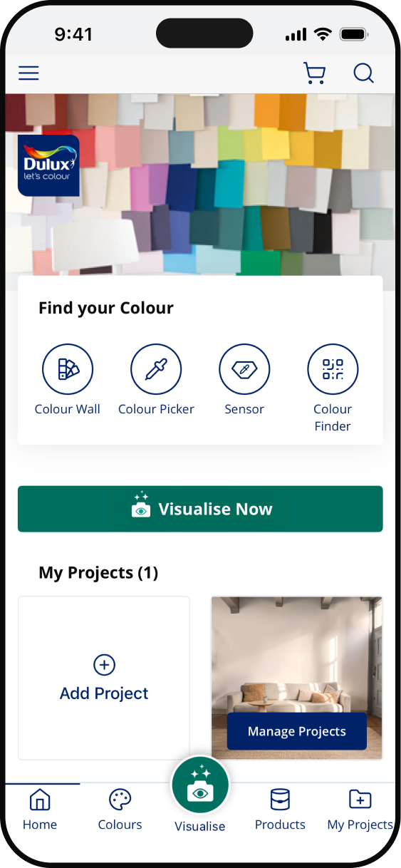
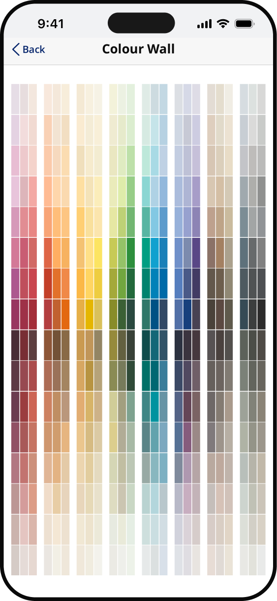
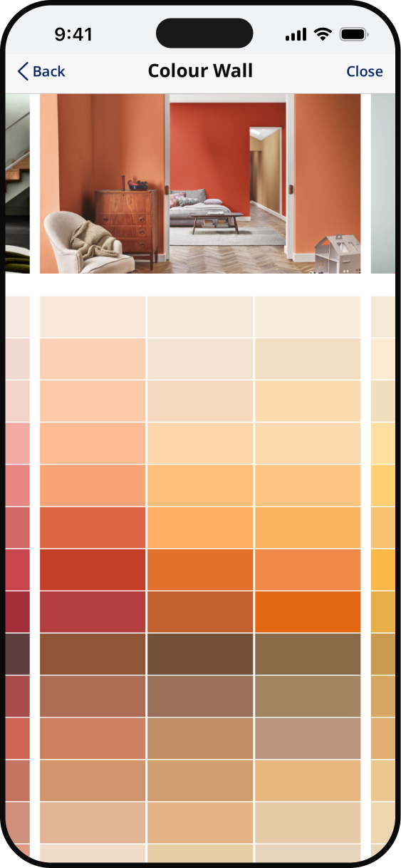
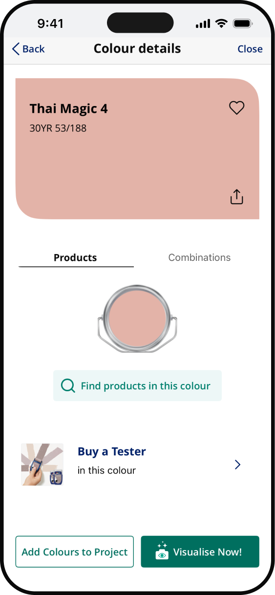
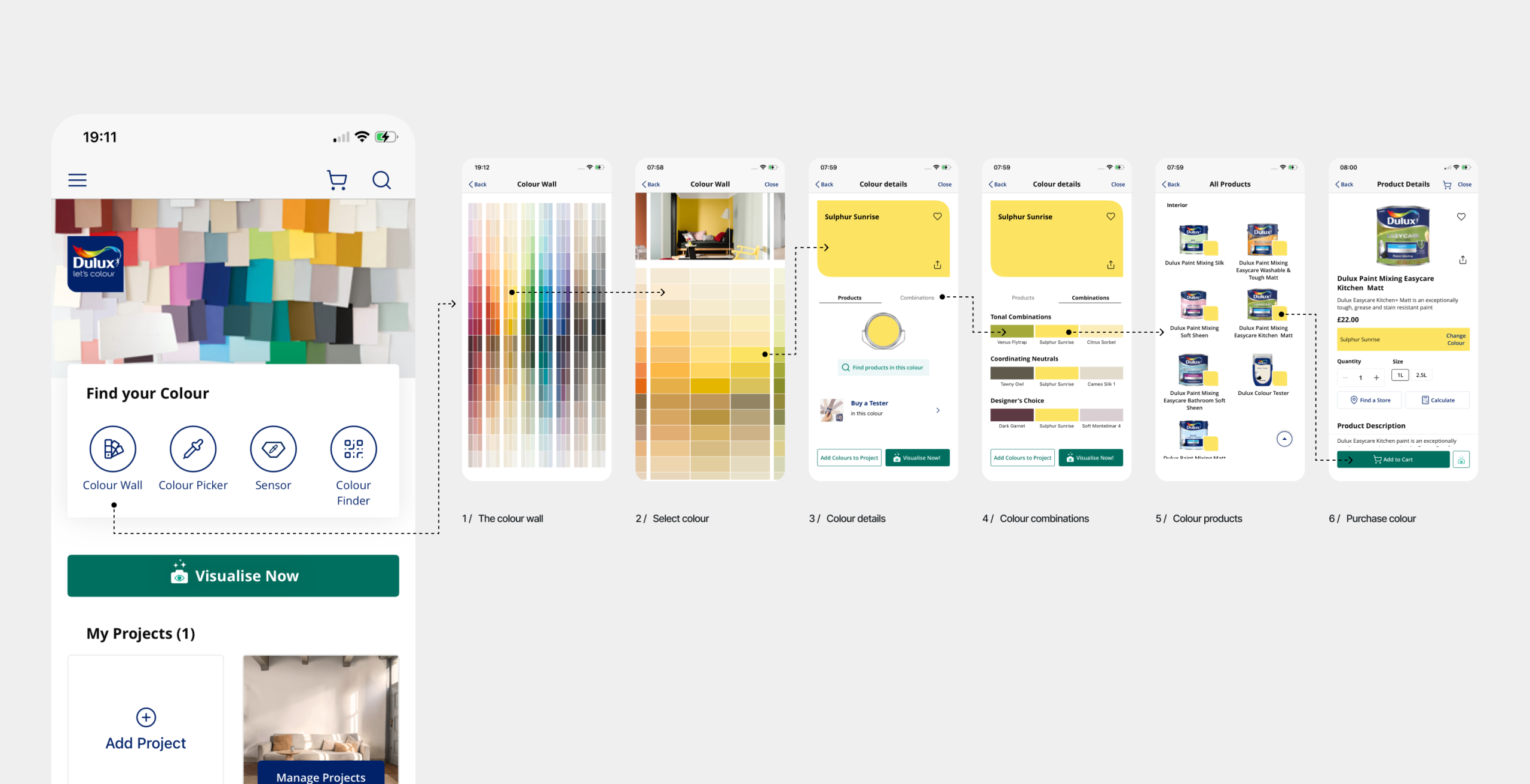
End-to-end commerce through the Colour Wall journey
Problem Framing
– Define jobs-to-be-done at each journey stage
– Map gap between colour on screen vs. colour on
wall anxiety
– Identify where inspiration ends and purchase intent begins
– Define personas (confident decorator vs. overwhelmed first-timer)
Colour Discovery & Exploration
– Design browsable colour wall with intuitive filtering
– Build mood/room/style-based colour entry points
– Design colour family navigation with smooth transitions
– Add LLM-powered natural language colour search (“warm terracotta”)
– Prototype colour pairing and palette suggestion feature
– Design “colours trending near you” contextual feed
Checkout & Post-Purchase
– Streamline guest checkout with minimal fields
– Design order confirmation with project timeline tips
– Build post-delivery colour satisfaction check-in
– Create follow-up flow for reorder or next-room planning
– Prompt user-generated photo upload after painting
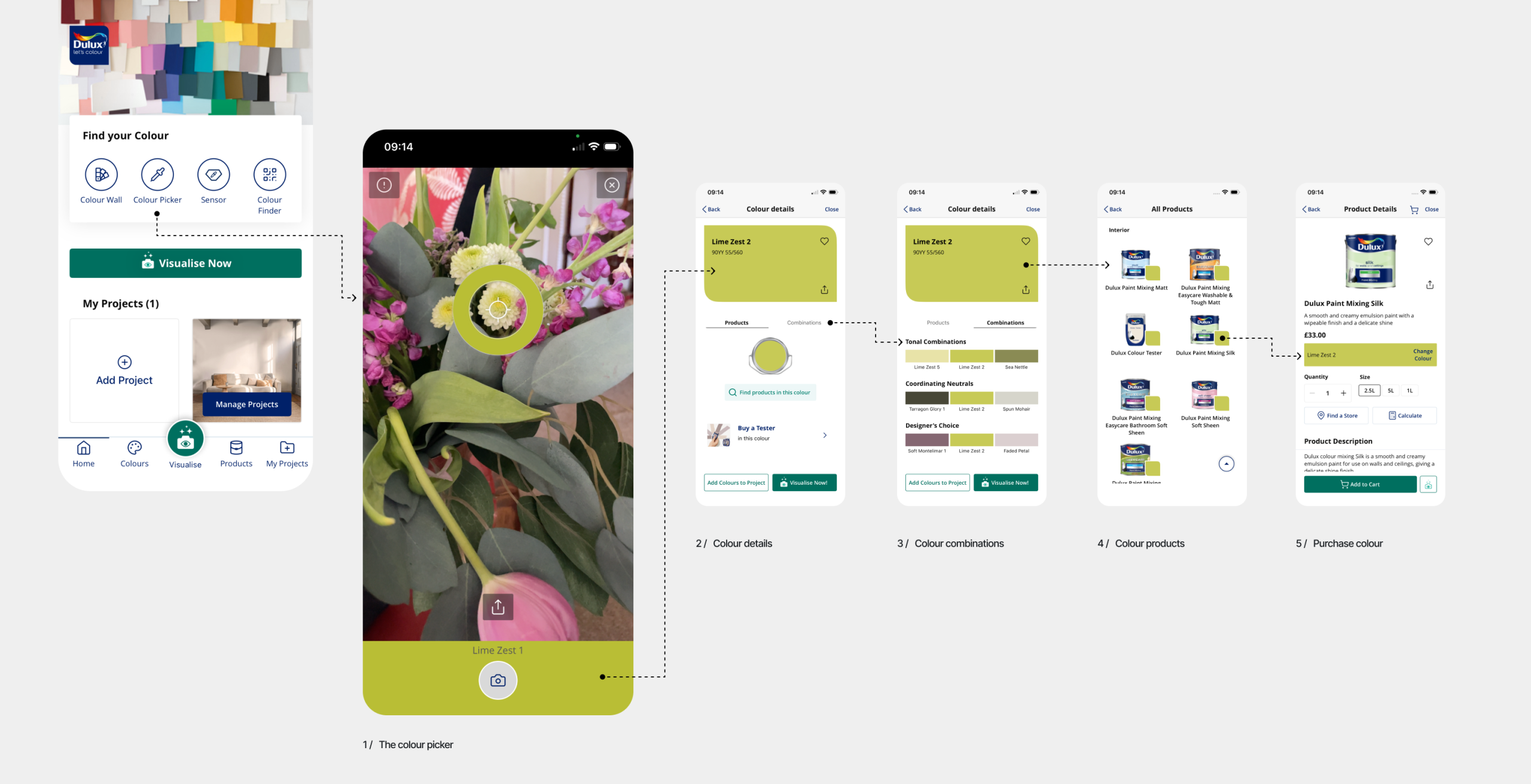
End-to-end commerce through the Colour Picker journey
Problem Framing
– Define jobs-to-be-done (match existing wall, object, fabric, inspo image)
– Map anxiety gap between captured colour and expected paint result
– Identify lighting and device camera variables that affect accuracy
– Define personas (renovator matching existing vs. creative colour-chasing)
Colour Capture & Detection
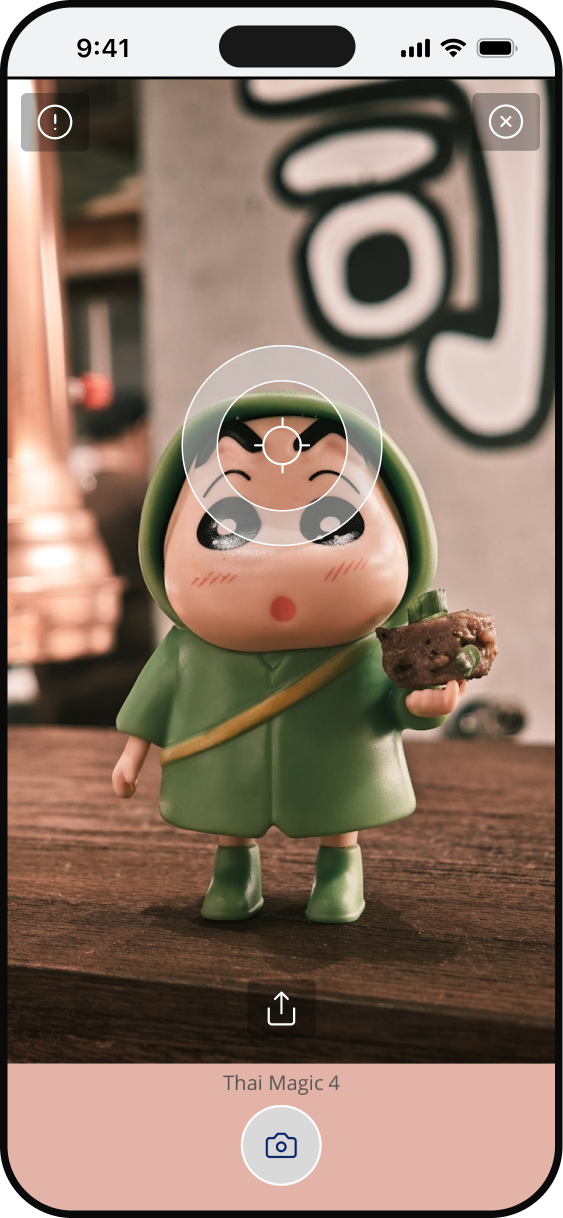
– Design intuitive camera viewfinder with colour lock mechanic
– Build real-time colour sampling with live hex/RGB preview
– Add tap-to-capture and drag-to-refine colour selection
– Design multi-point sampling for averaged colour matching
– Prototype image upload flow for offline or gallery-based capture
– Add surface texture detection to refine finish recommendation
Path to Purchase
– Surface paint calculator directly from match result screen
– Design one-tap add-to-basket from matched colour
– Show coverage and cost estimate per room size inline
– Add complementary products (primer, finish coat, tools)
– Design reorder flow anchored to previously matched colours
– Enable click-and-collect or delivery selection at point of match
Creating an intuitive Colour Visualiser journey
Problem Framing
– Define jobs-to-be-done (explore colours, plan project, convince household)
– Map gap between visualised result and real-world paint outcome anxiety
– Identify where creative exploration stalls and decisions get abandoned
– Define personas (solo decorator vs. collaborative household planner)
Room Capture & Setup
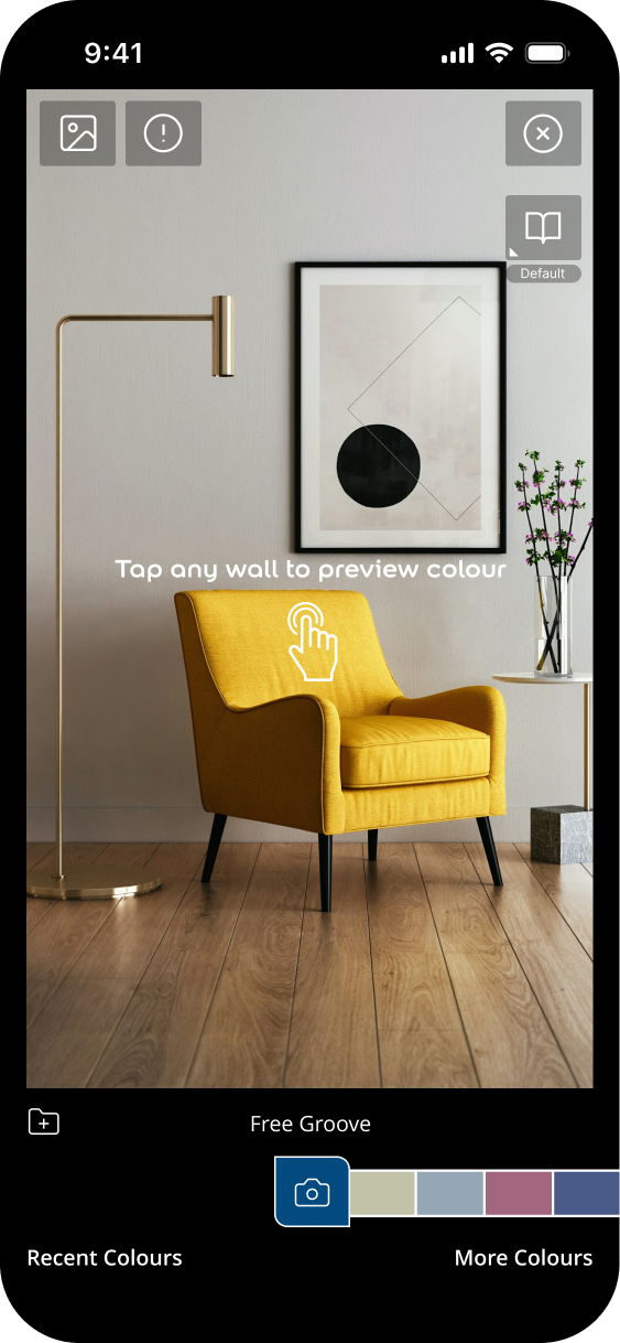
– Design guided photo capture flow with framing tips overlay
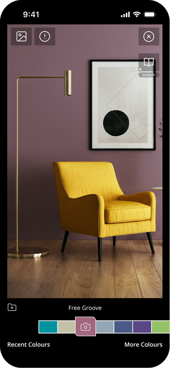
– Build automatic wall detection and segmentation from photo
– Add manual wall selection and correction tools for complex rooms
– Design room library with pre-built template rooms by type
– Prototype multi-surface detection (ceiling, trim, skirting, doors)
– Add room dimension input for accurate paint quantity estimation
Project Creation & Management
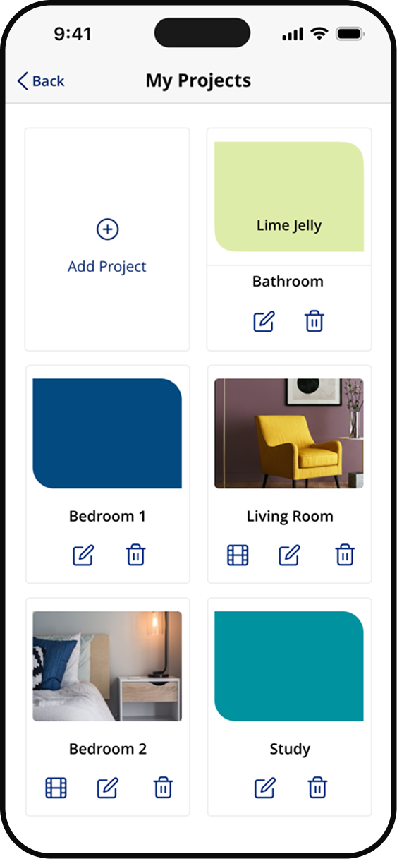
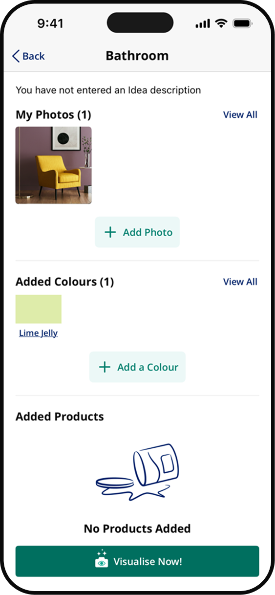
– Design project creation flow (name, room type, notes)
– Build multi-room project organisation within single scheme
– Enable colour scheme versioning to compare options side by side
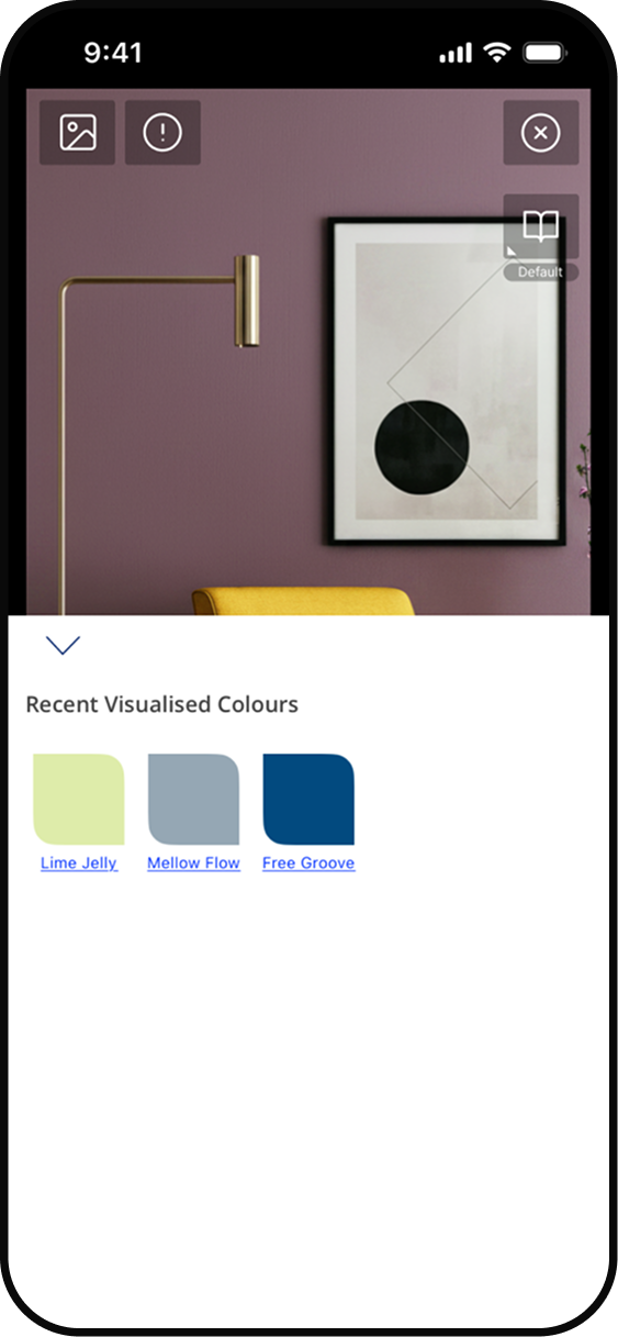
– Design project dashboard showing all rooms and applied colours
– Add project sharing flow for household collaboration and approval
– Build project status tracking from planning through to purchase
Building the and developing the design system
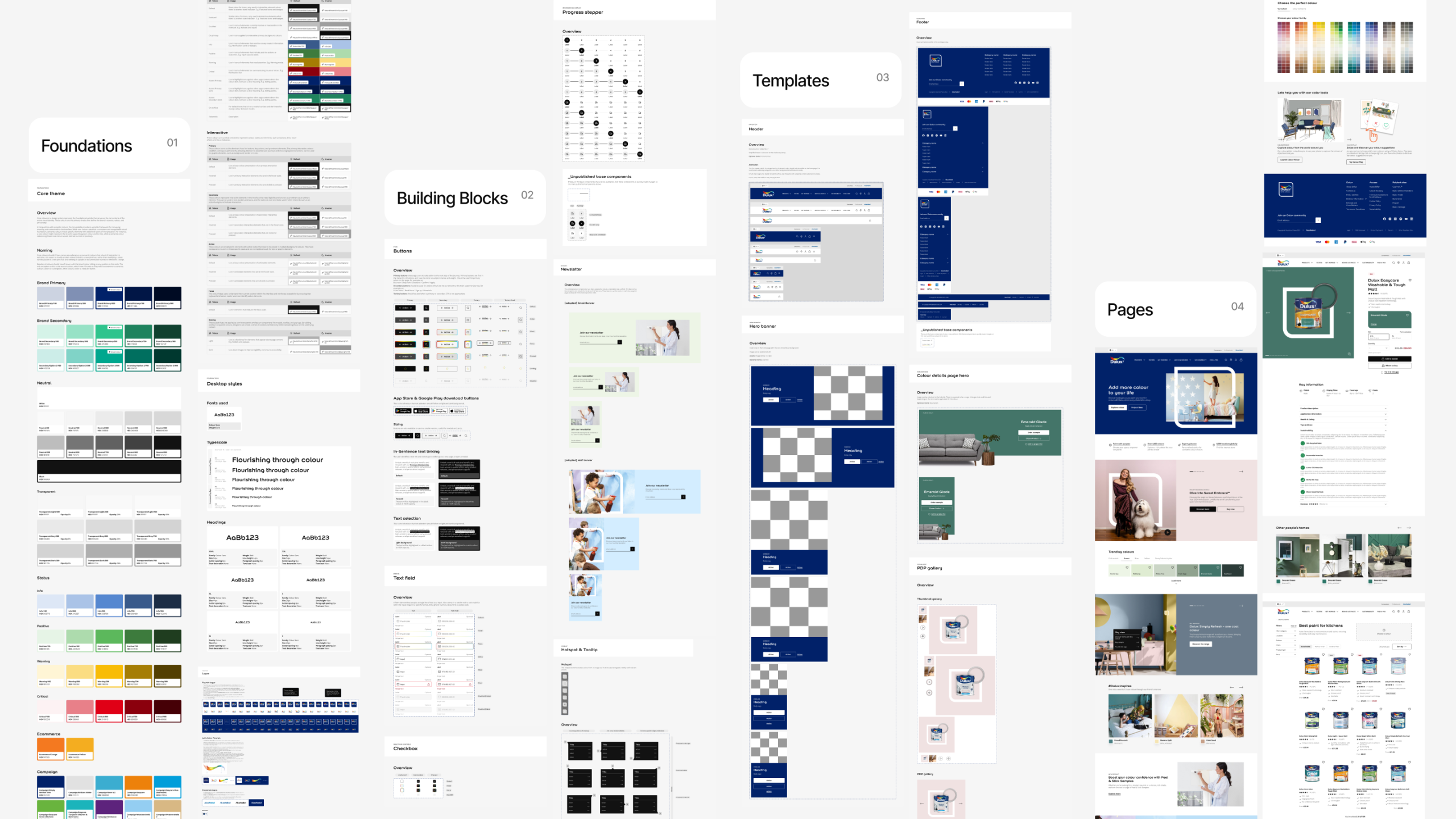
In 2024, AkzoNobel (parent company of the Dulux brand) began an extensive UX strategy and then a supporting design system project, aiming to streamline the user journey’s across multiple brand sites, and establish a scalable foundation for visual consistency across their digital ecosystem. Operating in 22 countries and 8 different customers markets, with 20 different languages, creating a single reusable framework was essential to improve the overall brand experience.
#012169
#005192
#3BADD0
#1F835E
#2FC48D
#97E2C6